
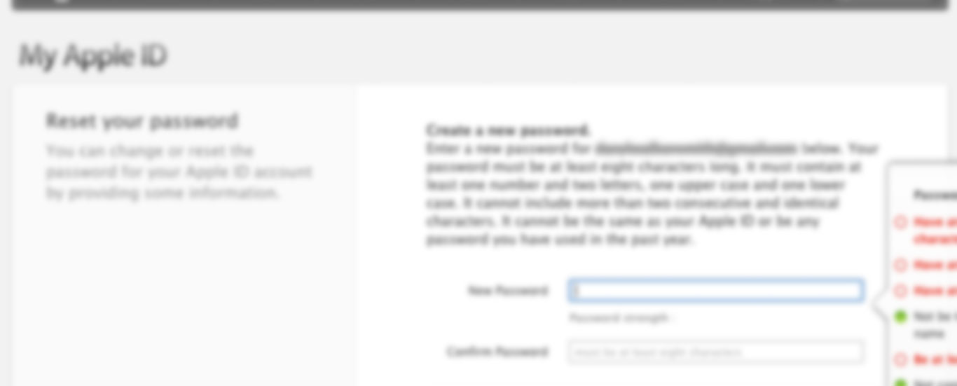
I was quite surprised when I stumbled across this today. Having forgotten the password to my Apple ID (a more regular occurrence than I’d like) I went through the usual email procedure to reset my password and noticed that the the helpful tips/password restrictions were far from helpful. As you’ll see from the screengrab below, they were hardly visible.
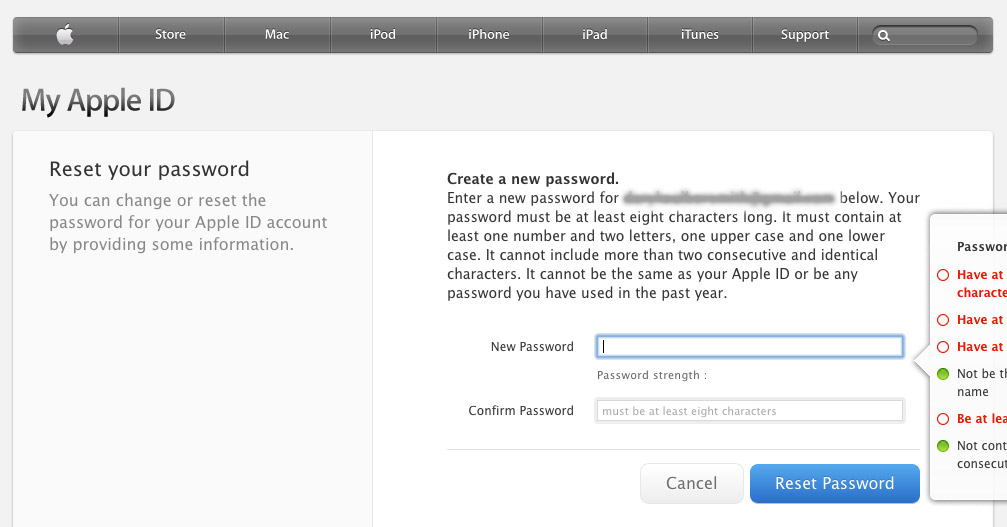
I did try what every respectable designer / UX professional would do and resize the viewport to see if that had any effect but the more I looked at the layout of the page I soon realised that there’s actually no room for the flyout message. Maybe this should be flying out from the left of the input field? No, that wouldn’t make much sense either.
It’s just reassuring to know that the big boys (with, lets face it, ridiculous budgets) get UX wrong too.
So why talk about it here? I’m not taking a pop at Apple (I might not be an Apple ‘fanboy’ but I regularly use and enjoy their products) but rather I’m highlighting a relatively small UX issue so that we can all learn from it.
Little UX issues like this will hopefully be forming part of one of my side projects (@drivvvle). So watch this space!
Update: Just to mention, this screengrab was taken on my MacBook Pro (OSX 10.9) using Chrome V31.